A serious episode from a gaming webcomic
Tim Buckley published Loss in Ctrl+Alt+Del on June 2, 2008. In four panels Ethan arrives at the hospital, speaks to the staff, and finds Layla on a bed after a pregnancy loss. The comic does without the usual verbal joke. For an audience used to the series' gaming humor, such an abrupt shift to a dramatic theme was unexpected and drew criticism.
Other webcomics and forum participants began parodying the episode. At first they repeated the characters, the hospital scene, and the composition; then the drawing gradually simplified. The story turned out unusual: the original plot was needed less and less for recognition, while the arrangement of figures was preserved. By 2018 the next wave was already built on the ability to see Loss in lines, dots, photographs of objects, and entirely unrelated images. This is a decade-long continuation of the meme's history, not the date the comic appeared.
What remains of the four panels
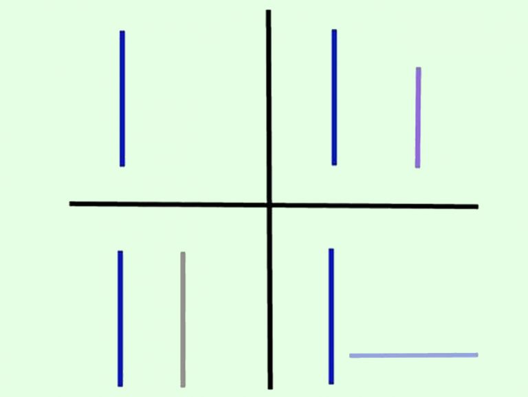
In the picture a light green field is divided into four parts by a black cross. In the upper left there is a single blue vertical segment. In the upper right there is a blue one and a shorter purple one; in the lower left, a blue one and a gray one. In the lower right the blue segment stands vertically and the purple one lies horizontally. There are no people, hospital setting, or text here.
A constant blue line helps trace one participant through the whole sequence. A second object appears after the first panel, and in the last one it changes position. Color makes reading easier, but what matters for recognizability is the number and orientation of the elements. This scheme already represents a minimalist remake: it keeps the framework of the original scenes without reproducing Buckley's drawing or the emotional expressions of his characters.
Recognition becomes the joke itself
In the ordinary comic the reader finds out what happened to the characters. In the minimalist Loss the task changes: one has to detect a hidden reference to the well-known comic. The question “Is this Loss?” accompanies pictures that at first glance are about architecture, food, or the random arrangement of things. The answer arises from comparing four small compositions, not from reading text.
The format allows varying degrees of camouflage. The black cross and colored lines show the structure almost openly. Objects in a natural setting may hide the same order down to the last detail. That is why both the hint and the delay in recognition matter: an arrangement that is too random does not form the needed sequence, while one that is too obvious turns into a simple emblem. The comic effect often lies in the moment when an ordinary picture suddenly starts to read as a familiar reference.
Where this order can be hidden
In an invented photograph, four shelf sections are filled with bottles. First there is one, then two, two more, and in the last section one stands and another lies down. The caption about moving explains the household setting, but the horizontal bottle reveals a second meaning. The objects do not become characters of the hospital story: they only repeat its steady scheme.
Another invented example shows four small garden plots. In the first grows one stake, the next two have pairs, and in the last one stake has fallen. Recognition happens through the position of things, although the colored segments have disappeared. In a third version, four windows of a house form a sequence of lamp silhouettes: one, two, two, one standing and one laid on its side. Light and household details disguise the order more effectively than a pure scheme does. In every version the last horizontal serves as the decisive clue, after which the earlier parts stop looking like independent coincidences.