Two versions of the same package
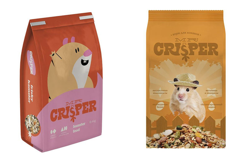
The local image shows two mockups of a feed bag: on the left, a minimalist illustrated hamster; on the right, a photo of a fluffy animal in a hat. The composition resembles a comparison of packaging concepts and visibly places two approaches side by side: an original drawing and a ready-made photographic image. The viral post was discussed as a story about a brand's choice, but it's important not to invent motives for the company that aren't in confirmed materials.
Publications about the project reported that designer Sonya Mudvex had proposed an illustrated design, while the published version used a photo of a hamster in a straw hat. Users debated which version was better, and part of the audience responded emotionally to the hat. However, the picture by itself shows only two images and doesn't prove who made the final decision or why it was made.
Why a cute image beats complex design
The comparison rests on instant readability. A drawn muzzle can convey character and stand out from a generic product, but a photo of an animal in a hat triggers an immediate reaction: the viewer recognizes the hamster and notices the small accessory. The cute image takes over, and the conversation about packaging quickly shifts to personal taste and preference.
The meme doesn't require picking an objective winner. One viewer values a clear, warm photograph; another prefers an illustration that fits better with the overall graphic system. The comedy comes from the contrast between a professional discussion of a visual solution and the blunt "but it's a hamster in a hat though." It's a way of joking about how one expressive element can pull all the attention away from the rest of the concept.
Examples for other design arguments
For a presentation, you could caption it: "Three weeks arguing over the identity, and the client picked the cat in the helmet." This example moves the situation to a work meeting and keeps the contrast between a complicated process and one charming decision. For a family chat: "We were picking a new sofa based on ergonomics; grandma votes for the one that doesn't slide." Here a practical detail decides the winner, not the stated concept.
Another option: "We discussed the typography, but everyone remembered the funny icon in the corner." That text suits a local image where the hat serves as the strong focal point. To keep the joke original, name an actual detail from your own layout that the audience noticed. Don't claim that users rejected the illustration or that the photo is objectively better: the original comparison shows reactions, not a final verdict.
Accuracy and respect for the original work
The meme is useful exactly where a specific trade-off is being discussed: an elaborate concept versus one charming detail that ends up settling the argument — the way the hat settled it here in the photo's favor. It reminds a team that the reader doesn't react to the whole presentation, but to that one single expressive little thing. In a personal feed, the joke works as a light-hearted choice between "stylish" and "unbearably cute," especially if the author isn't trying to stage a vote on real people.
Don't use the story to belittle the designer or to pin a conflict with the client on them. Don't add a claim to the image that one of the versions was officially approved or rejected unless that's confirmed. The caption should rely on what's visible: two different images of a hamster on the packaging and a hat that steals attention. Everything else should be presented only as your own joke or opinion.