A frog with uneven lines
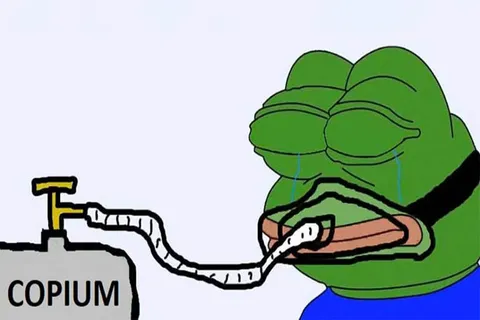
The picture is a close-up of a green frog’s head on a light gray background. The outline is drawn unevenly, as if with a mouse; the eyes are large and the gaze is sad, directed down and to the side; the lower lip is brown and drooping. At the bottom is the edge of a blue hoodie. There is no caption: it is a pure reaction image.
The untidiness is part of the design. Apu deliberately looks as if an unskilled user drew him, and this staged amateurism is what makes him touching.
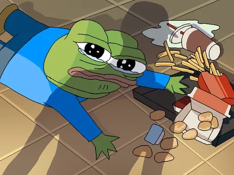
It is also important that the picture has no frame or props. There is no tray, no background and no second character, so the whole meaning rests on the face. This makes the template universal: the same picture can stand for shame, fatigue or quiet hurt.
The Finnish name and early traces
The English-language meme encyclopedia links Apu to the Finnish imageboard Ylilauta. The words “apu apustaja,” roughly “help, helper,” appeared there, according to search results, in January 2016. No archived threads documenting the character’s birth survive, so neither the exact author nor the day can be named.
The same reference mentions a Facebook page opened in January 2016 and posts on 4chan in March and April 2016. By October 2016 a parody featuring Apu had reached the front page of Reddit. So this is a story of several months of gradual growth rather than a single viral moment.
Where the frog itself comes from
The original Pepe was created by the American artist Matt Furie for the comic Boy’s Club, and began living an internet life long before Apu. Apu is a simplified, plaintive version of this figure. According to the meme encyclopedia, stylistically it draws on the earlier format of Spurdo Spärde, an equally deliberately crude bear cub.
On the Russian-language internet the name Pepe is often mixed up with political stories. That does not apply to the picture itself: as a meme, Apu mostly exists as an innocent and sad character.
Why crudeness works
The mechanics are simple: the worse the character is drawn, the more sincere its feeling looks. A perfect drawing would sound like a template, but this one sounds like the gesture of a friend who cannot draw but wants to say he is sad. Downcast eyes add embarrassment and an unwillingness to meet anyone’s gaze.
That is why Apu suits self-irony so well: a person admits to a weakness without dramatising it.
There is another layer: Apu always looks slightly lost. He is not angry and does not attack; he simply does not know where to look. That makes the template especially handy where ordinary words sound too loud and silence seems too odd. The caption is short, the emotion is clear, and there is nothing to argue with.
Examples of captions and analysis
“Me when I said I’d be at the meeting on time.” A confession of a personal habit, delivered quietly and without excuses.
“Message read, no reply.” The frog looks away, like a person who is waiting for an answer and pretending not to care.
“When I ordered the size that looked fine on the website.” An everyday awkwardness that fits well with the crushed expression.
“Everyone went out to dinner, and I remembered I hadn’t called home.” The guilt is delivered softly here, and you want to pity the hero.
How to use it
It suits short first-person captions that convey shame, disappointment or mild hurt. Do not put long text on it: its strength is brevity. It is better to leave the gray background as it is, so the texture of the uneven outline is not lost.