Who's depicted
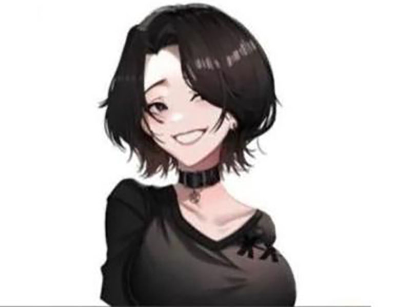
The drawing shows a girl with a short black bob: long bangs fall diagonally over one eye, the other eye is squinted, and there's a wide smile on her face. Dark circles are visible under her eyes, a black choker with a small pendant sits at her neck, and her clothing is dark — a V-neck T-shirt with a small design near the collar. The background is white.
This isn't a photograph or a frame from any specific show, but a drawing in anime style. The existing version is a standalone image, without a comparison.
The drawing alone tells you nothing about the character's mood or personality — the smile and the dark circles under her eyes are artistic details, not information about any real person.
From doomer girl to anime doomer girl
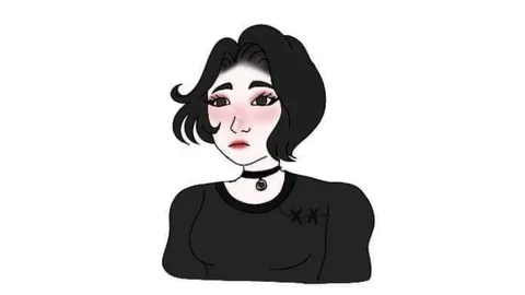
'Doomer' is an internet archetype of a tired, gloomy, listless person, and 'doomer girl' is the female variant — dark hair, dark clothing, a choker. The anime version is the same character reimagined in a Japanese drawing style: large expressive eyes, a clean facial outline, a soft smile.
According to an English-language meme reference site, the first anime version was posted on Twitter by user @harrishero10 on May 24, 2021. The image spread widely on July 15, 2021, when a Reddit user going by Rede331 posted a vertical comparison of the original with the anime version; according to the same source, the post collected more than 134,000 upvotes over 11 days, with a peak on July 26, 2021. This information comes from a single available source.
The comparison format
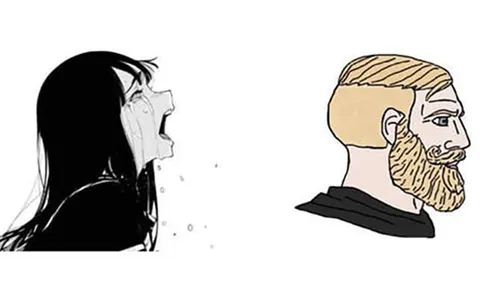
The meme works on a two-panel structure: the ordinary version on the left, the anime version on the right, with the second one framed as 'better' or 'more appealing.' The joke is that the drawing style changes the perception: the same character looks different when drawn with sparkling eyes.
Everyday things, rather than people, are often the ones compared: an object in its ordinary form versus the same object 'with an upgraded look.' That's the safest and liveliest way to use the format.
Comparison examples
Made-up pairs.
'Monday morning / Monday morning, but with coffee in a pretty mug.' It works because reality doesn't change — the packaging just makes it bearable.
'A report in a spreadsheet / the same report laid out in neat slides with gradients.' The presentation raises the perceived value, even though the data is identical.
'My kitchen / my kitchen in a photo with good lighting.' The classic gap between real life and the posted version.
'Sadness for no reason / sadness set to pretty music.' This version softens the subject without denying that it's still sadness.
How not to miss the mark
It's better to compare things, situations, interfaces, and memes rather than judging real people by their looks. Pairs where the only difference is presentation work especially well: the same text in a different font, the same soup in a different bowl. The drawing is just a drawing, but it shouldn't become an excuse to judge real people's appearance.
If you want a comparison with the original, look specifically for the paired version — a standalone drawing without its counterpart doesn't land as well. The judgment of 'better' is subjective here; some viewers prefer the old version, and a caption can even play on that disagreement. The artist behind the drawing itself is unknown; the Twitter username refers only to the first posting of the anime version, and the dates rely on a single source. The caption should be short, so the viewer has time to notice the smile on the right half.