An old rebus and the new 2018 wave
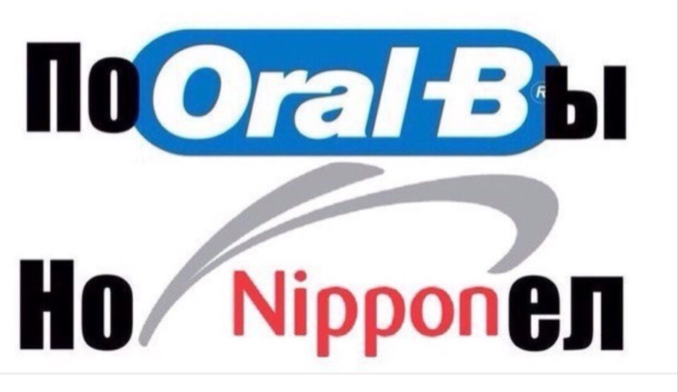
This device has no reliably established single inventor. The picture with Oral-B and Nippon was circulating already in the mid-2010s, before the large wave of logo memes in 2018. Recognizable names made it possible to assemble a Russian phrase using approximate pronunciation and small Cyrillic additions. Old advertising material turned into a colloquial remark, and the brand recognition itself became part of the puzzle-solving.
In June 2018, the VKontakte community “Screwed-Up Logos” appeared, publishing similar remixes, often with well-known meme phrases. The images spread to other large public pages as well. The new wave does not mean that reading brand names as parts of someone else's words was first invented at that time. Rather, it turned a familiar device into a shared game: users competed over how unexpected a phrase they could build from visually recognizable elements.
How the two lines of the picture are read
The top line begins with a black “Po,” then comes the blue oval Oral-B logo, and on the right a black letter “y” is added. The result is the joking “Would have roared with laughter.” The bottom line begins with “No”; in the middle are a gray sign and the red word Nippon, followed by “el.” The whole rebus is designed to be read as “Would have roared with laughter, but didn't get it,” although the second half requires a noticeable phonetic convention.
The white background and large signs leave enough room to see the assembly at a glance. The black additions differ from the colored brand names and show the limits of the intervention. The reader first recognizes the familiar advertising forms, then tries to pronounce them as part of a Russian phrase. For the bottom line the overall sense matters especially: the literal reading of Nippon does not match “didn't understand,” but the already begun remark hints at the right direction. The imperfect match is also part of the comic effect.
Why a familiar sign starts saying something else
A logo usually establishes one association: you see the shape and recall the brand. A meme adds a second task and makes you temporarily break that shape down into sounds or individual letters. The name loses its commercial meaning but keeps its font, color and outline. As a result, a neutral ad seems to utter a phrase it had no intention of uttering. Serious visual presentation and colloquial meaning exist at the same time.
The specific remark additionally jokes about a failed reaction. A person wanted to laugh out loud, yet did not figure out what was being shown to them. The picture itself first requires figuring out, so its content repeats the viewer's action: the viewer, too, stands before an incomprehensible construction and tries to assemble its meaning. It is a small self-contained joke. The more clearly the signs are recognized, the faster the reading begins; overly random fragments turn the image into an ordinary set of letters and remove the pleasure of colliding two functions.
Three new rebuses in everyday conversation
One can invent the answer “Mda” (a dismissive sigh, roughly “well, yeah…”), where the first letter is shown as the golden arches of McDonald's and “da” is added in ordinary type. Such a sign would suit a story about a person who spent five minutes looking for glasses that were already on his head. The recognizable restaurant symbol becomes a heavy sigh rather than a suggestion to grab a bite. A short phrase allows the logo's shape to be preserved almost entirely.
Another option is “I'm tired”: the red letter “Ya” from the familiar Yandex sign sits beside a simple caption. It can be sent after a discussion in which ten participants corrected a single comma. The third rebus is “Opyat” (“again”), beginning with the red ring of Opera and continuing with the word “pyat” (“five”); it responds to yet another renaming of the file “final.” All three examples are invented. They use different degrees of borrowing, but share the same logic: the viewer recognizes a commercial sign and unexpectedly hears in it a short human reaction.