From record sleeve design to a language of remakes
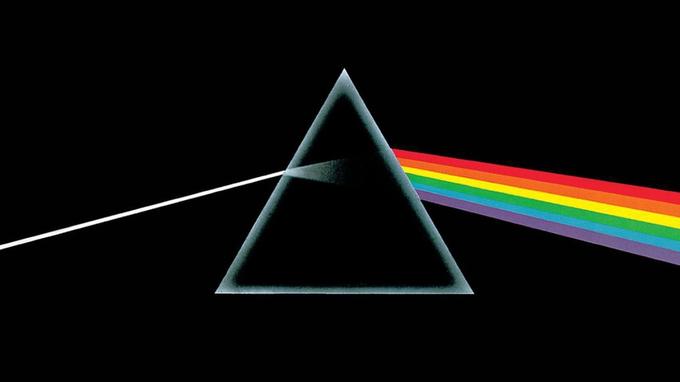
Pink Floyd’s album The Dark Side of the Moon came out in March 1973. The cover was prepared by the Hipgnosis studio: the concept is linked to Storm Thorgerson, and the artwork was executed by George Hardie. Instead of a portrait of the band, the design offered a simple optical scene. The contrast of a black field, a thin white beam, and a bright spectrum made the record recognizable by a few geometric elements.
Remakes appeared long before the meme wave of 2018. In 2000 The Squirrels released The Not-So-Bright Side of the Moon, reinterpreting Pink Floyd’s music and replacing the prism on the cover with the head of Rob Morgan. Later similar substitutions were made with Krusty from The Simpsons, the Death Star, and other familiar figures. In spring 2018, variants spread across Reddit in which the central object already explained a change in a person or in their tastes. This is a new way of applying an old composition, not the birth date of the drawing itself.
The white beam and six stripes
The image keeps the original scheme: a triangular prism sits almost at the center of the black space. A white beam approaches it from the left, widening inside, and on the right a fan of colored stripes emerges. The outline of the prism is light and semi-transparent; its interior stays dark. There is no album title, no faces, no objects in place of the triangle, and no captions that would already supply a ready-made joke.
The image is built like a sentence with three parts. The beam denotes the initial state, the prism the influence, and the spectrum the result. The left-to-right direction lets it be read almost like a story. The large empty field around the objects leaves room for captions, and the elements are distinct enough that changing one of them does not destroy the recognizability of the others.
Why the transformation looks convincing
A parody has two different moves. The first keeps the colors and places an unexpected object in the center: the familiar optical experiment suddenly depends on a cat, a character, or a kitchen appliance. The second labels three positions and turns the whole drawing into a causal diagram. A single action seems to break a person down into several desires, emotions, or obligations.
What is funny is an overly neat explanation of an untidy life. After a short conversation you usually cannot list all the new thoughts exactly, but the spectrum promises precisely such an order. The colored stripes look like a measurable result, although the captions may describe a completely subjective experience. In some remakes the rainbow was tied to sexual orientation; that association belongs to later jokes and does not explain the artistic intent of the 1973 design.
What passes through the prism
In an invented version, “one free evening” is written on the left, “open the game catalog” on the prism, and the colored stripes are labeled as five incompatible plans. The drawing explains why the person has not chosen anything yet but is already busy with all the options at once.
Another fictional variant depicts a short request, “stop by for bread,” which passes through a supermarket and turns into a full bag of groceries. The joke comes from the difference between a single beam and a wide output. In a third sketch, a photo of a cat passes through the family chat. What emerges are memories, recipes, weather reports, and an argument about whom he resembles more. Here the transformation concerns not the owner of the photo but the conversation that has started: a single topic unexpectedly branches into many independent threads.