The logo’s design
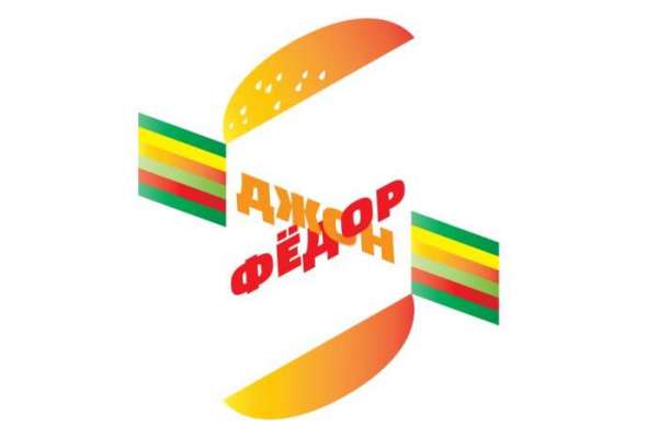
The logo is a stylized burger: rounded yellow-orange arcs on top and bottom stand in for the buns, and between them are bands of several colored layers (green, yellow, red, and burgundy) imitating lettuce, cheese, and patty.
Across this composition, two words, “John” and “Fedor,” are set diagonally in crossing lines, in red italic type. The crossing words visually echo the diagonal of the burger layers, so the lettering and background read as a single figure rather than text laid over a picture.
The warm yellow-orange palette with bright green and burgundy accents keeps the sign recognizable even at small sizes, which matters for a small street eatery whose sign has to be readable from a distance, on the storefront, and on social media.
The commission and the owner’s rejection
The logo was created by Artemy Lebedev’s studio on commission from a burger joint in Gomel. In an interview with Yuri Dud on his channel “vDud,” Lebedev named this one of his favorite works, explaining that he liked it for its wordplay and form.
The owner, however, did not like the result. The logo never appeared on the café’s signage, and the burger joint kept operating under its own, less noticeable visual identity.
A client rejecting work that the designer considers successful is not unusual in the advertising industry. But Lebedev’s public admission on a popular interview show is what made this particular case noticed well beyond the professional community.
Turning into a meme
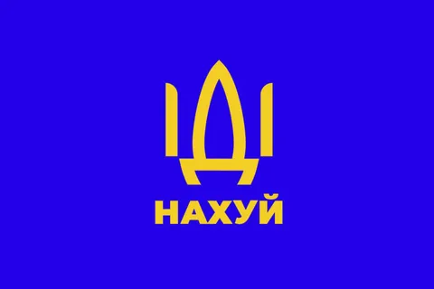
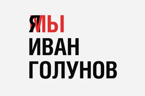
Once the story got out, the image spread across the internet separately from the story about the burger joint. Users began making their own versions of the same composition, replacing “John” and “Fedor” with other name pairs, brand names, or joke phrases, while keeping the crossed layout and the burger backdrop.
In this way, the logo of one specific business became a recognizable template that people use regardless of the original restaurant. Most remakes keep only the shape and color scheme and change the text entirely, which turns an authored design into a general-purpose joke generator.
Studio context
The story fits into a broader pattern in the Lebedev studio’s work, where a client rejects a finished design and the work then goes on to lead a public life of its own.
The studio and its founder regularly discuss such stories in interviews and on their own platforms, presenting client rejections as part of the working process rather than an exception. This openness about projects the client did not accept partly shapes the studio’s public image as a workshop with a strong authorial signature.
What remains unclear
The exact date the logo was created and what became of the burger joint itself are not known, since different retellings of the story give different details.
It is also unknown whether the owner saw the eventual wave of remakes online, and how he feels about the rejected logo becoming better known than the business it was made for. Whether the establishment still operates under any name is likewise not clearly traceable in open sources.