Two bindings on a white background
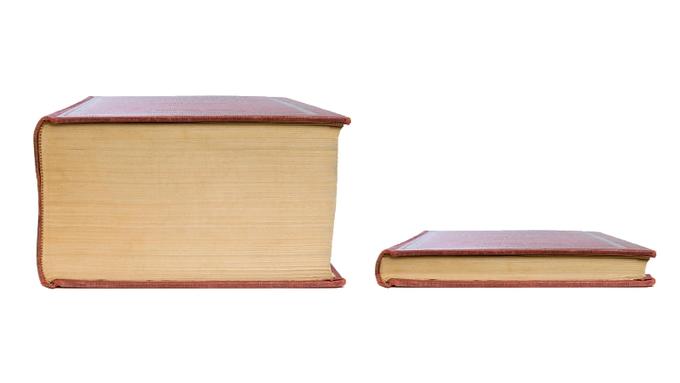
The photo shows two books with reddish-brown cloth bindings lying on a white background, shot from the side. On the left is a thick volume with wide yellowish page edges; on the right is a thin one, noticeably shorter and slightly narrower. There are no inscriptions on the spines or covers, so the entire meaning rests on the comparison of sizes.
The picture alone says nothing about the text inside. For the joke to work, captions are needed: one book stands for the full version, the other for a version with a discarded part. It is the captions that make the meme understandable; the photograph serves as the basis for the comparison.
Where the format came from
According to reports, the format appeared on Reddit in June 2019, when a user captioned a pair of books “Greek mythology” and “Greek mythology without Zeus’ sex life.” The exact date and the number of votes are not confirmed, so they are not given here.
It is also not confirmed that this was the very first instance: similar book comparisons may have appeared earlier. For that reason, the post is better regarded as a starting point of a known story rather than a proven first example. The photo of the books was most likely taken from a stock image; its author has not been identified.
How the pair works
The mechanics are simple: both objects are the same thing, but one is shown in full and the other without part of it. In the thin version, the omission is chosen so that the viewer immediately understands what has been cut. The laugh comes from the gap between the expectation of a full version and the short one. The more obvious the omission, the more precisely the joke works, which is why the captions are usually two or three words long.
Later the same scheme was applied to instructions, recipes, rules, schedules and news. What all the variants share: the caption on the thick book names the item in its entirety, while the caption on the thin one keeps only the most important or the funniest part.
Captions that rely on the omission
Below are four invented examples. All of them are built like the original pair: on the left, the complete object; on the right, the same object without the main thing.
“Washing machine instructions” and “Washing machine instructions: press start.” The omission reduces the entire manual to a single button. It is funny because the reader expected a multi-page document and got a single action.
“My weekend plan” and “My weekend plan: the couch.” The contrast between a long list and a single item works like a short pause: the reader expects activities and gets a refusal to do any of them.
“The whole story of the family tea” and “The whole story of the family tea: Mom said it went cold.” The thin version cuts the narrative off at a domestic detail, and the scale of the story shrinks to a single phrase.
“Terms of the rental agreement” and “Terms of the rental agreement: the deposit is returned.” The thin version can also be reassuring: instead of a long list, only the most necessary thing remains. The omission is not always about irony; it can also be about what matters most.
Where the template fits
The photo suits comparisons of two versions of the same item: a full text and a summary, a long conversation and a short outcome, a complicated instruction and its essence. It is important to pick a pair where the object is the same; otherwise the books become just a big thing and a small thing with no connection.
For the thin version, it is convenient to pick what viewers themselves would like to cut. Then the thickness of the book works as a metaphor, and the comparison is clear without a long caption.