What it is
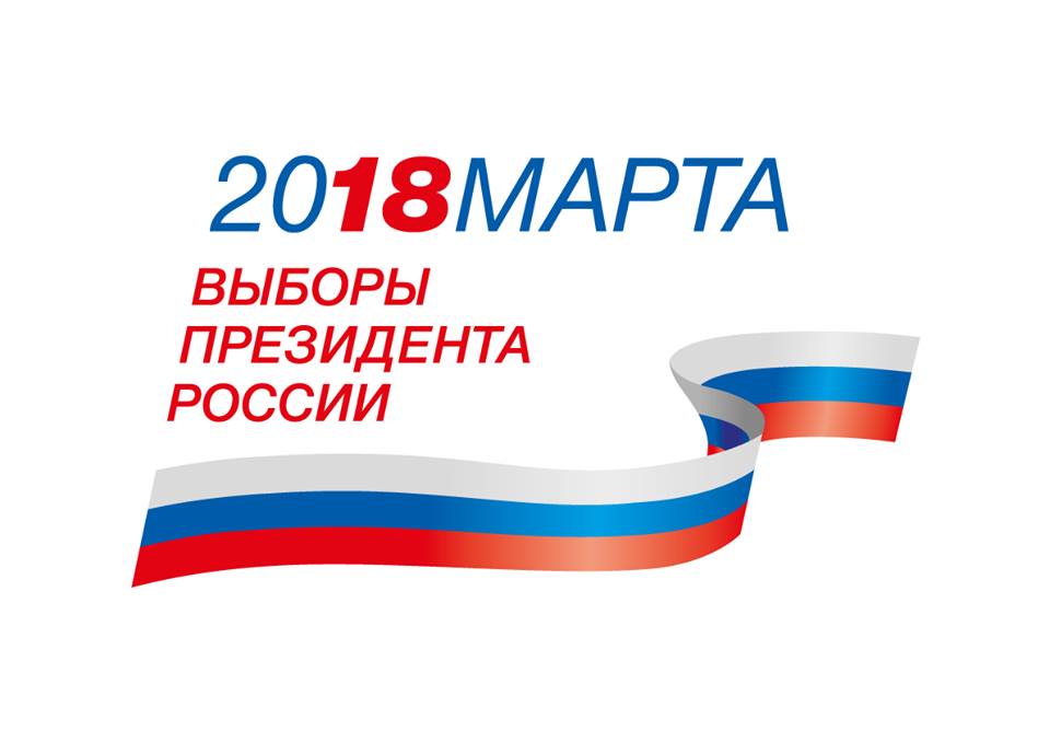
“Election Logo Worth 37 Million” is an internet meme built around the official emblem of the Russian presidential election scheduled for March 2018. The emblem consists of the inscription “2018 MARCH ELECTION OF THE PRESIDENT OF RUSSIA” with a tricolor ribbon in the colors of the Russian flag. In the word “2018,” the digits “18” are highlighted in red.
The image attached to the entry matches this description: it is the official logo, not a placeholder or a different object. The meme relates to a political topic, so the text is limited to facts about the creation of the emblem, the sum that appeared in publications, and audience reaction.
Creation and cost
The logo was presented by the Central Election Commission on November 29, 2017. According to Meduza, the developer was the company IMA-Consulting, which won the CEC's creative competition for the visual concept of the information campaign. Its general director, Vartan Sarkisov, reported that the options were tested on residents of twelve cities, and the result, in his words, is perceived as “state-like, solid, conservative, but not archaic.”
The cost of the work, according to media reports, was 37 million rubles. This figure became a point of criticism: many users felt that for that money the result was too simple. In the verified materials, no comments from government bodies about the cost were found beyond the fact of the logo's presentation itself.
Criticism and user drawings
On social media the logo was criticized for being schematic and for resembling an image from a stock photo site. Some users suggested the flag was traced from a ready-made image; Meduza compared the compositions and noted that the overall shape matches, but the proportions of the ribbons differ. The Moscow Times, for its part, wrote about the ambiguity of the English version of the inscription, where the date, according to critics, was unclear.
Members of online communities began drawing their own versions of the emblem. Some of the drawings were just as conservative but, as publications noted, cost nothing. These variants became the basis of the meme: the logo turned into a reason for irony about the cost of state design.
Political context
The meme is connected to the official symbolism of an election campaign, so discussing it inevitably touches on political context. This article describes facts: who developed the emblem, what sum appeared in publications, how it was evaluated, and how the audience reacted.
Assessments of the logo's quality remain subjective. Some called it clear and strict, others a step back compared with the 2012 election emblem; the latter view was expressed by an author of The Moscow Times, and it should be read as that author's opinion.
Conclusion
The logo remains an example of how official design becomes a target of internet humor. The meme's popularity is tied to a combination of price, parody versions, and media coverage rather than to the emblem itself.
In further work with this entry, the figures and dates should be checked against primary CEC publications and the developer's materials, since most of the numbers come from media retellings.